4. BondGraphTools
Contents:
In the following section a group of different examples in diverse domains of physics are modeled by using a Python library called BondGraphTools, designed and developed by Peter Cudmore.
4.1. Introduction
BondGraphTools is a python library for building and manipulating symbolic models of complex physical systems, built upon the standard scientific python libraries [1]. Here a number of examples from electrical circuits, fluid mechanics, and biochemical reactions are illustrated and modeled by the BondGraphTools (BGT). BondGraphTools dynamically generates Julia code, uses the DifferentialEqations.jl interface to solve the DAE, and passes the results back to python for analysis and plotting [1]. The codes can be executed by entering them into an IPython session or a Jupyter notebook [1]. Here we have opted for the Jupyter notebook.
4.2. Examples
4.2.1. Electrical Circuits
4.2.1.1. Electrical Circuit #1
The circuits are adopted from [2]

Fig. 4.1 Schematic of Circuit #1 (R: resistor, C: capacitor, \({u}\): potential, \({v}\): flow)
In the first step, the BondgraphTools library must be imported:
import BondGraphTools as bgt
To create a new model using BondGraphTools (bgt), the command bgt.new is used:
model=bgt.new(name='circuit_1')
In the next step, all the parameters’ values are defined:
C1_value=100e-6
C2_value=150e-6
R_value=100e+3
These values are then assigned to bgt components using the following commands:
C1=bgt.new("C", value=C1_value)
C2=bgt.new("C", value=C2_value)
R=bgt.new("R", value=R_value)
Also, a number of “0-junctions & 1-junctions” must be defined (based on our model) as follows:
zero_junc_1=bgt.new("0")
zero_junc_2=bgt.new("0")
one_junc=bgt.new("1")
Now creating the model and its components has finished and all of them must be assembled using the bgt.add command:
bgt.add(model,C1,C2,R,zero_junc_1,zero_junc_2,one_junc)
According to our bond graph model, these components must be connected to the related junctions by bgt.connect. Note that the first element in parenthesis represents the “tail” of the arrow and the second element represents the “head”:
bgt.connect(C1,zero_junc_1)
bgt.connect(zero_junc_1,one_junc)
bgt.connect(one_junc,R)
bgt.connect(one_junc,zero_junc_2)
bgt.connect(zero_junc_2,C2)
By drawing the model, one can see if the components are connected properly to each other or not:
bgt.draw(model)
A sketch of the network will then be produced:
Fig. 4.2 Bondgraph diagram representing Electrical Circuit #1
Now that the bond graph demonstration of the system is done, we can illustrate its behaviour during a specific time interval and with arbitrary initial conditions for the state variables. The constitutive relations of the model can be shown as well:
timespan=[0,50]
model.state_vars
Out[ ]: {'x_0': (C: C1, 'q_0'), 'x_1': (C: C2, 'q_0')}
==>
x0={"x_0":1, "x_1":0}
==>
model.constitutive_relations
Out[ ]: [dx_0 + x_0/10 - x_1/15, dx_1 - x_0/10 + x_1/15]
By using the command “bgt.simulate” and entering the model, time interval, and the initial conditions we prepare the requirements for plotting the system time behaviour:
t, x = bgt.simulate(model, timespan=timespan, x0=x0)
x vs t can be plotted by importing “matplotlib.pyplot” (\({q}_{C1}\) & \({q}_{C2}\) are state variables of the system which represent the amount of the electric charge accumulated in each capacitor):
import matplotlib.pyplot as plt
plt.plot(t,x[:,0], '-b', label='q_C1')
plt.plot(t,x[:,1], '-r', label='q_C2')
plt.xlabel("time (s)")
plt.ylabel("electric charge (Coulomb)")
plt.legend(loc='upper right')
plt.grid()
Fig. 4.3 Behaviour of the system in time (accumulated electric charge in each capacitor vs time)
Since the capacitor flow is the derivative of q with respect to time:
it can be plotted by converting the considered state variable (either x[:,0] or x[:,1]) to an array by importing the numpy library and then calculating its gradient with 0.1 steps:
# dq_C1/dt = v_C1 (flow in C1)
import numpy as np
f = np.array(x[:,0], dtype=float)
slope=np.gradient(f,0.1)
v_C1=slope

# dq_C2/dt = v_C2 (flow in C2)
import numpy as np
f = np.array(x[:,1], dtype=float)
slope=np.gradient(f,0.1)
v_C2=slope
Plotting the flows in the two capacitors:
plt.plot(t,v_C1, '-b', label='V_C1')
plt.plot(t,v_C2, '-r', label='V_C2')
plt.xlabel("time (s)")
plt.ylabel("Flow (Coulomb/s)")
plt.legend(loc='upper right')
plt.grid()
Fig. 4.4 Flow in C1 and C2 vs time
Moreover, the potential in each element can be calculated based on their constitutive equations:
Resistor: \(u=R.v\)
Capacitor: \(u=q/C\)
Thus:
u_R=R._params['r']*v_C2
u_C1=x[:,0]/C1._params['C']
u_C2=x[:,1]/C2._params['C']
The time variation of the corresponding potential for each component can be plotted all-in-one in a figure using the for command:
for u, c, label in [(u_C1,'-r','u_C1'), (u_C2,'-b','u_C2'), (u_R,'-g','u_R')]:
    fig=plt.plot(t,u,c,label=label)
    plt.legend(loc='upper right')

plt.grid()
plt.xlabel("time (s)")
plt.ylabel("Potential (J/Coulomb)")
which results in:
Fig. 4.5 Potential change in each component (R, C1, C2) vs time
4.2.1.2. Electrical Circuit #2
The circuits are adopted from [2]

Fig. 4.6 Schematic of Circuit #2 (R: resistor, C: capacitor, \({u}\): potential, \({v}\): flow)
The rationale behind the following set of commands are described in the Electrical Circuit #1 documentation.
import BondGraphTools as bgt
model=bgt.new(name='circuit_2')
# Parameters' values
C1_value=150e-6     #(150 uF)
C2_value=100e-6     #(100 uF)
C3_value=220e-6     #(220 uF)

R1_value=100e+3      #(100 k)
R2_value=10e+3       #(10 k)


C1=bgt.new("C", value=C1_value)
C2=bgt.new("C", value=C2_value)
C3=bgt.new("C", value=C3_value)
R1=bgt.new("R", value=R1_value)
R2=bgt.new("R", value=R2_value)

zero_junc=bgt.new("0")
one_junc1=bgt.new("1")
one_junc2=bgt.new("1")

bgt.add(model,C1,C2,C3,R1,R2,zero_junc,one_junc1,one_junc2)

bgt.connect(C1,one_junc1)
bgt.connect(one_junc1,R1)
bgt.connect(one_junc1,zero_junc)
bgt.connect(zero_junc,C2)
bgt.connect(zero_junc,one_junc2)
bgt.connect(one_junc2,R2)
bgt.connect(one_junc2,C3)

bgt.draw(model)
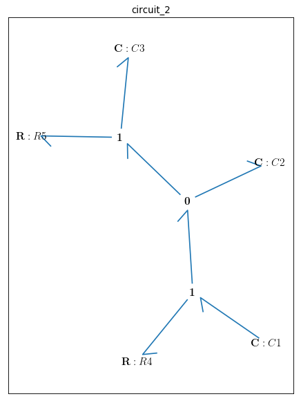
Fig. 4.7 Bondgraph diagram representing Electrical Circuit #2
Time interval and initial conditions for the state variables are defined as follows:
timespan=[0,50]
model.state_vars
Out[ ]:{'x_0': (C: C1, 'q_0'), 'x_1': (C: C2, 'q_0'), 'x_2': (C: C3, 'q_0')}
There are 3 state variables in this circuit: ( \({q}_{C1}\), \({q}_{C2}\), \({q}_{C3}\)) which are the electric charges corresponding to the 3 capacitors: {C1, C2, C3}
x0={"x_0":1, "x_1":0, "x_2":0}
The constitutive relations of the model are given as:
model.constitutive_relations
Out[ ]:
[dx_0 + x_0/15 - x_1/10,
 dx_1 - x_0/15 + 11*x_1/10 - 5*x_2/11,
 dx_2 - x_1 + 5*x_2/11]
Plotting the system time behaviour by entering the model, time interval, and the initial conditions:
t, x = bgt.simulate(model, timespan=timespan, x0=x0)
import matplotlib.pyplot as plt
plt.plot(t,x[:,0], '-b', label='q_C1')
plt.plot(t,x[:,1], '-r', label='q_C2')
plt.plot(t,x[:,2], '-g', label='q_C3')
plt.xlabel("time (s)")
plt.ylabel("electric charge (Coulomb)")
plt.legend(loc='upper right')
plt.grid()
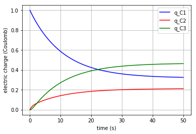
Fig. 4.8 Time behaviour of the system (accumulated electric charge in each capacitor vs time)
Since the capacitor flow is the derivative of q with respect to time:
it can be plotted by converting the considered state variable (either x[:,0], x[:,1] or x[:,2]) to an array by importing the numpy library and then calculating its gradient with 0.1 steps:
# - dq_C1/dt = v_C1 (flow)
import numpy as np
f = np.array(x[:,0], dtype=float)
slope=np.gradient(f,0.1)
v_C1=-slope
# dq_C2/dt = v_C2 (flow)
f = np.array(x[:,1], dtype=float)
slope=np.gradient(f,0.1)
v_C2=slope
# dq_C3/dt = v_C3 (flow)
f = np.array(x[:,2], dtype=float)
slope=np.gradient(f,0.1)
v_C3=slope
Plotting the flows in the three capacitors:
plt.plot(t,v_C1, '-b', label='v_C1')
plt.plot(t,v_C2, '-r', label='v_C2')
plt.plot(t,v_C3, '-g', label='v_C3')
plt.xlabel("time (s)")
plt.ylabel("flow (Coulomb/s)")
plt.legend(loc='upper right')
plt.grid()
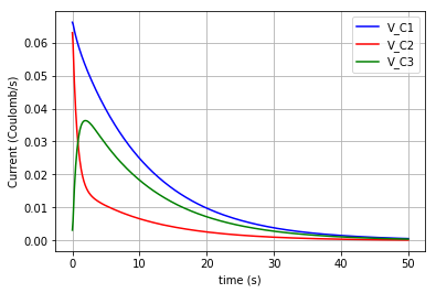
Fig. 4.9 Flows in C1, C2 & C3 vs time
Moreover, the potential in each element can be calculated based on their constitutive equations:
Resistor: \(u=R.v\)
Capacitor: \(u=q/C\)
Thus:
u_R1=R1._params['r']*v_C1
u_R2=R2._params['r']*v_C3

u_C1=x[:,0]/C1._params['C']
u_C2=x[:,1]/C2._params['C']
u_C3=x[:,2]/C3._params['C']
The time variation of the corresponding potential for each capacitor is plotted in a figure using the for command:
for u, c, label in [(u_C1,'-b','u_C1'), (u_C2,'-r','u_C2'), (u_C3,'-g','u_C3')]:
    fig=plt.plot(t,u,c,label=label)
    plt.legend(loc='upper right')

plt.grid()
plt.xlabel("time (s)")
plt.ylabel("Potential (J/Coulomb)")
which results in:
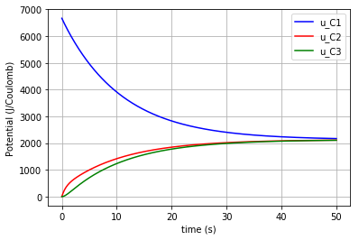
Fig. 4.10 Potential change in each capacitor (C1, C2, C3) vs time
4.2.1.3. Electrical Circuit #3
The circuits are adopted from [2] .

Fig. 4.11 Schematic of Circuit #3 (R: resistor, C: capacitor, \({u}\): potential, \({v}\): flow)
The rationale behind the following set of commands are described in the Electrical Circuit #1 documents.
import BondGraphTools as bgt
model=bgt.new(name='circuit_3')

# Parameters' values
C1_value=1000e-6    #(1000 uF)
C2_value=470e-6     #(470 uF)
L1_value=100e-6     #(100 uH)
R1_value=10e3       #(10 k)
R2_value=10e3       #(10 k)
R3_value=1e3        #(1 k)
R4_value=1e3        #(1 k)

C1=bgt.new("C", value=C1_value)
C2=bgt.new("C", value=C2_value)
L1=bgt.new("I", value=L1_value)
R1=bgt.new("R", value=R1_value)
R2=bgt.new("R", value=R2_value)
R3=bgt.new("R", value=R3_value)
R4=bgt.new("R", value=R4_value)

zero_junc=bgt.new("0")
one_junc1=bgt.new("1")
one_junc2=bgt.new("1")

bgt.add(model,C1,C2,L1,R1,R2,R3,R4,zero_junc,one_junc1,one_junc2)

bgt.connect(C1,one_junc1)
bgt.connect(one_junc1,R1)
bgt.connect(one_junc1,R4)
bgt.connect(one_junc1,zero_junc)
bgt.connect(zero_junc,C2)
bgt.connect(zero_junc,one_junc2)
bgt.connect(one_junc2,R2)
bgt.connect(one_junc2,R3)
bgt.connect(one_junc2,L1)

bgt.draw(model)
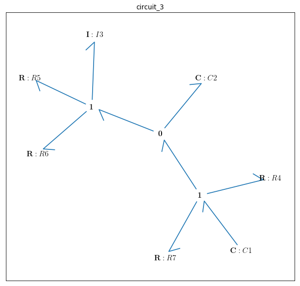
Fig. 4.12 Bondgraph diagram representing Electrical Circuit #3
Time interval and initial conditions for the state variables are defined as follows:
timespan=[0,100]
model.state_vars
Out[ ]:{'x_0': (C: C1, 'q_0'), 'x_1': (C: C2, 'q_0'), 'x_2': (I: I3, 'p_0')}
There are 3 state variables in this circuit: \({q}_{C1}\), \({q}_{C2}\) corresponding to the 2 capacitors: {C1, C2} and \({p}_{L1}\) corresponding to the only inductor {L1}. Here the initial conditions for the 3 state variables and the constitutive relations of the model are given as:
x0={"x_0":1, "x_1":0, "x_2":0}
model.constitutive_relations
Out[ ]:
[dx_0 + x_0/11 - 193423597678917*x_1/1000000000000000,
 dx_1 - x_0/11 + 193423597678917*x_1/1000000000000000 + 10000*x_2,
 dx_2 - 212765957446809*x_1/100000000000 + 110000000*x_2]
Plotting the system time behaviour by entering the model, time interval, and the initial conditions:
t, x = bgt.simulate(model, timespan=timespan, x0=x0)
import matplotlib.pyplot as plt
plt.plot(t,x[:,0], '-b', label='q_C1')
plt.plot(t,x[:,1], '-r', label='q_C2')
plt.xlabel("time (s)")
plt.ylabel("electric charge (Coulomb)")
plt.legend(loc='upper right')
plt.grid()
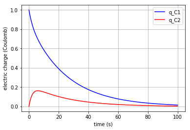
Fig. 4.13 Time behaviour of the system (accumulated electric charge in each capacitor vs time)
Plotting the flow in the inductor:
v_L1=x[:,2]/L1._params['L']
plt.plot(t,v_L1, '-g', label='V_L1')
plt.xlabel("time (s)")
plt.ylabel("flow (Coulomb/s)")
plt.legend(loc='upper right')
plt.grid()
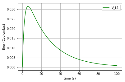
Fig. 4.14 Time behaviour of the system (flow of the inductor L1 vs time)
Since the capacitor flow is the time derivative of q and the derivative of the inductor flow is the fraction of \(u\) to \(L\) :
the capacitors flows (\({v}_{C1}\) & \({v}_{C2}\)) can be plotted by converting the considered state variable (either x[:,0] or x[:,1]) to an array by importing the numpy library and then calculating its gradient with 0.1 steps. Note that the inductor flow can also be gained by deducting \({v}_{C2}\) from \({v}_{C1}\) :
# dq_C1/dt = v_C1 (flow in C1)
import numpy as np
f = np.array(x[:,0], dtype=float)
slope=np.gradient(f,0.1)
v_C1=-slope

# dq_C2/dt = v_C2 (flow in C2)
f = np.array(x[:,1], dtype=float)
slope=np.gradient(f,0.1)
v_C2=slope

# dV_L1/dt = a_L1
# v_L1=v_C1-v_C2
The time derivative of the inductor flow is:
which can be calculated by:
a_L1=np.gradient(v_L1,0.1)
The 3 flows in the 3 branches of the circuit are plotted:
plt.plot(t,v_C1, '-b', label='V_C1')
plt.plot(t,v_C2, '-r', label='V_C2')
plt.plot(t,v_L1, '-g', label='V_L1')
plt.xlabel("time (s)")
plt.ylabel("Flow (Coulomb/s)")
plt.legend(loc='upper right')
plt.grid()
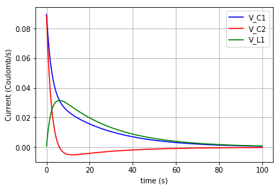
Fig. 4.15 Flows in C1, C2 & L1 (\({v}_{C1}\), \({v}_{C2}\), \({v}_{L1}\) vs time)
Furthermore, the potential in each element can be calculated based on its constitutive equation:
Resistor: \(u=R.v\)
Capacitor: \(u=q/C\)
Inductor: \(u=L.dv/dt\)
Thus:
u_C1=x[:,0]/C1._params['C']
u_C2=x[:,1]/C2._params['C']

u_L1=L1._params['L']*a_L1

u_R1=R1._params['r']*v_C1
u_R2=R2._params['r']*v_L1
u_R3=R3._params['r']*v_L1
u_R4=R4._params['r']*v_C1
Then the potentials of the three elements ( \({u}_{C1}\), \({u}_{C2}\) & \({u}_{L1}\) ) are plotted:
for u, c, label in [(u_C1,'-b','u_C1'), (u_C2,'-r','u_C2'), (u_L1,'-g','u_L1')]:
    fig=plt.plot(t,u,c,label=label)
    plt.legend(loc='upper right')

plt.grid()
plt.xlabel("time (s)")
plt.ylabel("Potential (J/Coulomb)")
which results in:
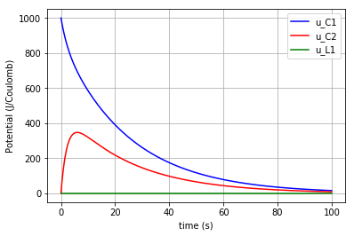
Fig. 4.16 Potential change in the capacitors & inductor (C1, C2 & L1) vs time
Due to the scale difference in potential levels, the potential of the inductor (\(u_{L1}\)) is also plotted separately:
fig=plt.plot(t,u_L1,'-g', label='u_L1')
plt.grid()
plt.legend(loc='upper right')
plt.xlabel("time (s)")
plt.ylabel("Potential (J/Coulomb)")
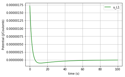
Fig. 4.17 Potential change in the inductor L1 vs time
4.2.2. Fluid Mechanics
4.2.2.1. Straight tube
The figures (1) & (2) are adopted from [2] and [3], respectively. The sample values of the parameters are also taken from the latter for the simulation to be more close to reality.

Fig. 4.18 Schematic of Straight vessel (\(u\): potential)

Fig. 4.19 Bondgraph diagram representing Straight Vessel (R: viscous resistance, C: vessel wall compliance, I: mass inertial effect, \(u\): potential, \({v}\): flow)
In the first step, the BondgraphTools library must be imported:
import BondGraphTools as bgt
To create a new model using BondGraphTools (bgt), the command bgt.new is used:
model=bgt.new(name='straight tube')
* Note that since we are working with the fluid mechanics components, the measures are different from electrical circuits but still the bond graph elements are the same.
In the next step, all the parameters’ values are defined and directly assigned to their corresponding bgt components using the following commands:
Se1=bgt.new("Se",value=11.997e6)     #(J/m6)
Se2=bgt.new("Se",value=10.664e6)     #(J/m6)

C=bgt.new("C", value=0.60015e-6)     #(m6/J)

# The amounts R-elements are assumed to be equal in a straight tube
R1=bgt.new("R", value=10.664e-6)     #(J.s/m6)
R2=bgt.new("R", value=10.664e-6)     #(J.s/m6)

# The amounts of the I-elements are assumed to be equal in a straight tube
L1=bgt.new("I", value=0.06665e6)     #(J.s2/m6)
L2=bgt.new("I", value=0.06665e6)     #(J.s2/m6)
* Note that to create a pressure difference in the vessel we need to insert two potential sources (Se1, Se2).
Also, a number of “0-junctions & 1-junctions” must be defined (based on our model) as follows:
zero_junc=bgt.new("0")
one_junc_1=bgt.new("1")
one_junc_2=bgt.new("1")
Now creating the model and its components has finished and all of them must be assembled using the bgt.add command:
bgt.add(model,Se1,Se2,C,R1,R2,L1,L2,zero_junc,one_junc_1,one_junc_2)
According to our bond graph model, these components must be connected to the related junctions by bgt.connect. Note that the first element in parenthesis represents the “tail” of the arrow and the second element represents the “head”:
bgt.connect(Se1,one_junc_1)
bgt.connect(one_junc_1,R1)
bgt.connect(one_junc_1,L1)
bgt.connect(one_junc_1,zero_junc)
bgt.connect(zero_junc,one_junc_2)
bgt.connect(zero_junc,C)
bgt.connect(one_junc_2,R2)
bgt.connect(one_junc_2,L2)
bgt.connect(Se2,one_junc_2)
By drawing the model, one can see if the components are connected properly to each other or not:
bgt.draw(model)
A sketch of the network will then be produced:
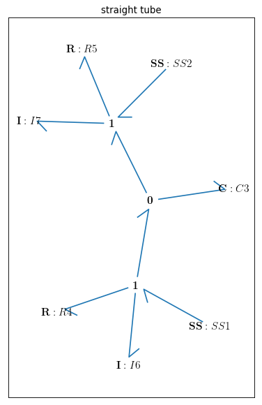
Fig. 4.20 Straight tube bond graph topology
Now that the bond graph demonstration of the system is done, we can illustrate its behaviour during a specific time interval and with arbitrary initial conditions for the state variables. The constitutive relations of the model can be shown as well:
timespan=[0,5]
model.state_vars
Out[ ]:
{'x_0': (C: C3, 'q_0'), 'x_1': (I: I6, 'p_0'), 'x_2': (I: I7, 'p_0')}
Initial conditions:
x0={"x_0":5*1e-6, "x_1":0, "x_2":0}
Constitutive relations:
model.constitutive_relations
Out[ ]:
[dx_0 - 2344336084021*x_1/156250000000000000 + 2344336084021*x_2/156250000000000000,
 dx_1 + 166625010414063*x_0/100000000 + x_1/6250000000 - 11997000,
 dx_2 - 166625010414063*x_0/100000000 + x_2/6250000000 - 10664000]
By using the command “bgt.simulate” and entering the model, time interval, and the initial conditions we simulate the system over the given time period:
t, x = bgt.simulate(model, timespan=timespan, x0=x0)
x vs t can be plotted by importing “matplotlib.pyplot” (\({q}_{C}\), \({p}_{L1}\) & \({p}_{L2}\) are state variables of the system which represent the amount of volume accumulated in the C-element and the momentum in 2 identical I-elements, respectively). Here, the flow of the I-element is plotted first which is the fraction of momentum (x[:,1]) to L1 value:
I-element: \(v=p/L\)
Plotting the flow in the I-element:
v_L1=x[:,1]/L1._params['L']
import matplotlib.pyplot as plt

plt.plot(t,v_L1, '-r', label='v_L1 & v_L2')
plt.xlabel("time (s)")
plt.ylabel("flow (m3/s)")
plt.legend(loc='upper right')
plt.grid()
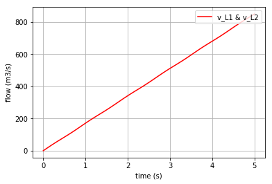
Fig. 4.21 Flow of the I-elements vs time
It can be anticipated that the scale of the stored volume (\({q}_{C}\)) is smaller than of the momentum in the I-elements. Hence, the \({q}_{C}\) is plotted separately:
plt.plot(t,x[:,0], '-b', label='q_C')
plt.xlabel("time (s)")
plt.ylabel("volume (m3)")  #metre3
plt.legend(loc='upper right')
plt.grid()
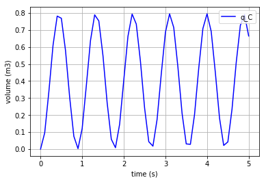
Fig. 4.22 Accumulated volume in the C-elements vs time
Since the flow in the C-element is the time derivative of q and the derivative of the I-element flow is the fraction of \(u\) to \(L\),
by importing numpy and converting the first state variable \({q}_{C}\) to an array and taking the gradient of it with 0.1 steps, one can obtain the flow passed through the C-element. The flows corresponding to the I-elements are merely the second and third state variables (x[:,1] & x[:,2]):
#  dq_C/dt = v_C (flow in the C-element)

import numpy as np
f = np.array(x[:,0], dtype=float)
slope=np.gradient(f,0.1)
v_C=slope
Plotting the flow of the C-element (\({v}_{C}\)):
import matplotlib.pyplot as plt
plt.plot(t,v_C, '-g', label='v_C')
plt.xlabel("time (s)")
plt.ylabel("flow (m3/s)")
plt.legend(loc='upper right')
plt.grid()
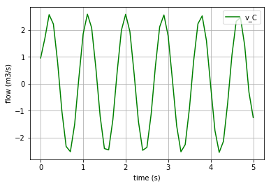
Fig. 4.23 Flow in the C-element vs time
In order to calculate the potential of the I-elements, we need to take the time derivative of their flows and multiply each by the mass inertial value (L). Also, to calculate the potential of the C-element we just need to multiply the compliance value (C) by the stored volume (\({q}_{C}\)):
# u_L1=L1*a_L1 (potential of the identical I-elements)==> u_L1=u_L2
f = np.array(v_L1, dtype=float)
dv_L1=np.gradient(f,0.1)
a_L1=dv_L1
u_L1=L1._params['L']*a_L1

# u_C=C*v_C (potential of the C-element)
u_C=C._params['C']*(x[:,0])
To plot the potential of L1:
fig=plt.plot(t,u_L1,'-m', label='u_L1 & u_L2')
plt.grid()
plt.legend(loc='upper right')
plt.xlabel("time (s)")
plt.ylabel("Potential (J/m3)")
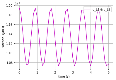
Fig. 4.24 Potential in the I-element vs time
To plot the potential of C-element:
fig=plt.plot(t,u_C,'-y', label='u_C')
plt.grid()
plt.legend(loc='upper right')
plt.xlabel("time (s)")
plt.ylabel("Potential (J/m3)")
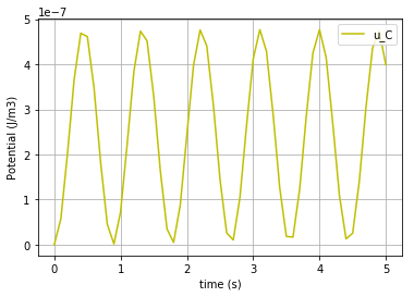
Fig. 4.25 Potential in the C-element vs time
4.2.2.2. Branching vessel
The figures (1) & (2) are adopted from [2] and [3], respectively. The sample values of the parameters are also taken from the latter for the simulation to be more close to reality.

Fig. 4.26 Schematic of Branching Vessel (\(u\): potential, \({v}\): flow)

Fig. 4.27 Bondgraph diagram representing Branching Vessel (R: viscous resistance, C: vessel wall compliance, I: mass inertial effect, \(u\): potential, \({v}\): flow)
The following set of commands are described in the Straight tube documents.
import BondGraphTools as bgt
model=bgt.new(name='branching vessel')

Se=bgt.new("Se",value=9.331e6)
Sf1=bgt.new("Sf",value=7.998e6)
Sf2=bgt.new("Sf",value=7.998e6)

C=bgt.new("C", value=0.60015e-6)
C1=bgt.new("C", value=0.125281e-6)
C2=bgt.new("C", value=0.1125281e-6)

R=bgt.new("R", value=1.333e6)
R1=bgt.new("R", value=10.564e6)
R2=bgt.new("R", value=10.664e6)

L=bgt.new("I", value=0.123e6)
L1=bgt.new("I", value=0.08665e6)
L2=bgt.new("I", value=0.06665e6)
* Note that in order to represent the pressure and volume difference in the vessel, one must use the potential & flow sources (Se & Sf). These are illustrated in the latter figure by \({u}_{in}\) and \(v_{out}\).
“0-junctions & 1-junctions” :
zero_junc_1=bgt.new("0")
zero_junc_2=bgt.new("0")
zero_junc_3=bgt.new("0")

one_junc_1=bgt.new("1")
one_junc_2=bgt.new("1")
one_junc_3=bgt.new("1")
Assembling the model components:
bgt.add(model,Se,Sf1,Sf2,C,C1,C2,R,R1,R2,L,L1,L2,zero_junc_1,zero_junc_2,zero_junc_3,one_junc_1,one_junc_2,one_junc_3)
Connecting the junctions and the components:
bgt.connect(Se,one_junc_1)
bgt.connect(one_junc_1,R)
bgt.connect(one_junc_1,L)
bgt.connect(one_junc_1,zero_junc_1)
bgt.connect(zero_junc_1,C)
bgt.connect(zero_junc_1,one_junc_2)
bgt.connect(zero_junc_1,one_junc_3)
bgt.connect(one_junc_2,R1)
bgt.connect(one_junc_2,L1)
bgt.connect(one_junc_2,zero_junc_2)
bgt.connect(zero_junc_2,C1)
bgt.connect(zero_junc_2,Sf1)
bgt.connect(one_junc_3,L2)
bgt.connect(one_junc_3,R2)
bgt.connect(one_junc_3,zero_junc_3)
bgt.connect(zero_junc_3,C2)
bgt.connect(zero_junc_3,Sf2)
Drawing the bong graph representation of the model:
bgt.draw(model)
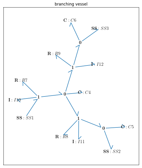
Fig. 4.28 Bondgraph diagram for Branching Vessel
Defining the time span:
timespan=[0,12.5]
Depicting the state variables of the model (6 state variables):
model.state_vars
Out[ ]:
{'x_0': (C: C4, 'q_0'),
 'x_1': (C: C5, 'q_0'),
 'x_2': (C: C6, 'q_0'),
 'x_3': (I: I10, 'p_0'),
 'x_4': (I: I11, 'p_0'),
 'x_5': (I: I12, 'p_0')}
Setting the initial conditions of the state variables:
x0={"x_0":10*1e-6, "x_1":4*1e-6, "x_2":4*1e-6, "x_3":0, "x_4":0, "x_5":0}
Constitutive relations of the model:
model.constitutive_relations
Out[ ]:
{dx_0 - 813008130081301*x_3/100000000000000000000 + 115406809001731*x_4/10000000000000000000 + 2344336084021*x_5/156250000000000000,
 dx_1 - 115406809001731*x_4/10000000000000000000 - 7998000,
 dx_2 - 2344336084021*x_5/156250000000000000 - 7998000,
 dx_3 + 166625010414063*x_0/100000000 + 108373983739837*x_3/10000000000000 - 9331000,
 dx_4 - 166625010414063*x_0/100000000 + 798205633735363*x_1/100000000 + 121915753029429*x_4/1000000000000,
 dx_5 - 166625010414063*x_0/100000000 + 888666919640517*x_2/100000000 + 160*x_5}
Simulating th model over the given time period and with the initial conditions:
t, x = bgt.simulate(model, timespan=timespan, x0=x0)
Plotting the first 3 state variables vs time (\({q}_{C}\), \({q}_{C1}\) & \({q}_{C2}\) which are the stored volume in the three C-elements):
# plotting state variables (q_C, q_C1 & q_C2) in 3 C-elements (C, C1 & C2)
import matplotlib.pyplot as plt
for q, c, label in [(x[:,0],'r', 'q_C'), (x[:,1],'b', 'q_C1'), (x[:,2],'g', 'q_C2')]:
    fig=plt.plot(t,q,c, label=label)
    plt.xlabel("time (s)")
    plt.ylabel("volume (m3)") #metre3
    plt.legend(loc='upper right')
    plt.grid()
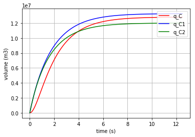
Fig. 4.29 Accumulated volume in the C-elements vs time
In the same way the momentum in the 3 I-elements (\({p}_{L}\), \({p}_{L1}\) & \({p}_{L2}\)) are shown:
# plotting state variables (p_L, p_L1 & p_L2) in 3 I-elements (L, L1 & L2)
import matplotlib.pyplot as plt
for l, c, label in [(x[:,3],'r', 'p_L'), (x[:,4],'b', 'p_L1'), (x[:,5],'g', 'p_L2')]:
    fig=plt.plot(t,l,c, label=label)
    plt.xlabel("time (s)")
    plt.ylabel("momentum (J.s/m3)")
    plt.legend(loc='upper right')
    plt.grid()
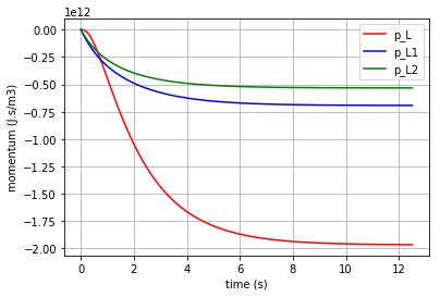
Fig. 4.30 Momentum in the I-elements vs time
Since the flow in the C-element is the time derivative of q and the time derivative of the I-element flow is the fraction of \({u}\) to \(L\),
by importing numpy and converting the first three state variables \({q}_{C}\), \({q}_{C1}\) & \({q}_{C2}\) to arrays and taking the gradient of them with 0.1 steps, one can obtain the flow passed through the C-elements. The flows corresponding to the I-elements are merely the fraction of the second 3 state variables (x[:,3], x[:,4] & x[:,5]) to their L values.
Calculating the flow & potential in C:
import numpy as np
f = np.array(x[:,0], dtype=float)
slope=np.gradient(f,0.1)
v_C=slope

u_C=(1/C._params['C'])*x[:,0]]
Calculating the flow & potential in C1:
import numpy as np
f = np.array(x[:,1], dtype=float)
slope=np.gradient(f,0.1)
v_C1=slope

u_C1=(1/C1._params['C'])*x[:,1]
Calculating the flow & potential in C2:
import numpy as np
f = np.array(x[:,2], dtype=float)
slope=np.gradient(f,0.1)
v_C2=slope

u_C2=(1/C2._params['C'])*x[:,2]
Calculating the flow & potential in L:
v_L=x[:,3]/L._params['L']
import numpy as np
f = np.array(v_L, dtype=float)
slope=np.gradient(f,0.1)
dv_L=slope
u_L=L._params['L']*dv_L
Calculating the flow & potential in L1:
v_L1=x[:,4]/L1._params['L']
import numpy as np
f = np.array(v_L1, dtype=float)
slope=np.gradient(f,0.1)
dv_L1=slope
u_L1=L1._params['L']*dv_L1
Calculating the flow & potential in L2:
v_L2=x[:,5]/L2._params['L']
import numpy as np
f = np.array(v_L2, dtype=float)
slope=np.gradient(f,0.1)
dv_L2=slope
u_L2=L2._params['L']*dv_L2
Now by using the for command the potentials of the 3 C-elements can be plotted in one figure for comparison:
for u, c, label in [(u_C,'r', 'u_C'), (u_C1,'b', 'u_C1'), (u_C2,'g', 'u_C2')]:
    fig=plt.plot(t,u,c,label=label)
    plt.xlabel("time (s)")
    plt.ylabel("potential (J/m3)")
    plt.legend(loc='upper right')
    plt.grid()
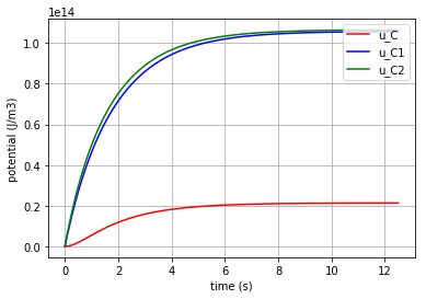
Fig. 4.31 Potential in the C-elements vs time
Plotting the potentials in the three I-elements:
for u, c, label in [(u_L,'r','u_L'), (u_L1,'b','u_L1'), (u_L2,'g','u_L2')]:
    fig=plt.plot(t,u,c,label=label)
    plt.xlabel("time (s)")
    plt.ylabel("potential (J/m3)")
    plt.legend(loc='upper right')
    plt.grid()
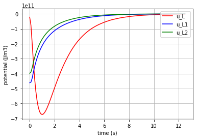
Fig. 4.32 Potential in the I-elements vs time
Plotting the flows in the three C-elements:
for v, c, label in [(v_C,'r','v_C'), (v_C1,'b','v_C1'), (v_C2,'g','v_C2')]:
    fig=plt.plot(t,v,c, label=label)
    plt.xlabel("time (s)")
    plt.ylabel("flow (m3/s)")
    plt.legend(loc='upper right')
    plt.grid()
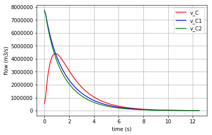
Fig. 4.33 Flow in the C-elements vs time
Plotting the flows in the three I-elements:
for v, c, label in [(v_L,'r','v_L'), (v_L1,'b','v_L1'), (v_L2,'g','v_L2')]:
    fig=plt.plot(t,v,c,label=label)
    plt.xlabel("time (s)")
    plt.ylabel("flow (m3/s)")
    plt.legend(loc='upper right')
    plt.grid()
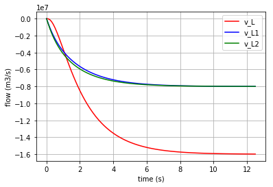
Fig. 4.34 Flow in the I-elements vs time
4.2.3. Biochemical Reactions
4.2.3.1. Diffusion
The definitions in this document are adopted from [2].

Fig. 4.35 Schematic of Diffusion
In the first step, the BondgraphTools library must be imported:
import BondGraphTools as bgt
To create a new model using BondGraphTools (bgt), the command bgt.new is used:
model=bgt.new(name='Diffusion')
In the next step, the parameters’ values are defined:
K_A=5263.6085
K_B=3803.6518
R=8.314
T=300
where K_A & K_B are species thermodynamic constants [\(mol^{-1}\)], R is the ideal gas constant [\(J/K/mol\)] and T is the absolute temperature [\(K\)] [4]. These values are then assigned to bgt components using the following commands:
Ce_A = bgt.new("Ce", name="A", library="BioChem", value={'k':K_A, 'R':R, 'T':T})
Ce_B = bgt.new("Ce", name="B", library="BioChem", value={'k':K_B, 'R':R, 'T':T})
reaction = bgt.new("Re", library="BioChem", value={'r':None, 'R':R, 'T':T})
The reaction rate ‘r’ is set to “None” in order to change it inside a for loop.
Also, two “0-junctions” must be defined (based on the diffusion model) as follows:
A_junction = bgt.new("0")
B_junction = bgt.new("0")
Now creating the model and its components has finished and all of them must be assembled using the bgt.add command:
bgt.add(model, Ce_A, Ce_B,A_junction, B_junction, reaction)
According to our bond graph model, these components must be connected to the related junctions by bgt.connect. Note that the first element in parenthesis represents the “tail” of the arrow and the second element represents the “head”:
bgt.connect(Ce_A, A_junction)
bgt.connect(A_junction, reaction)
bgt.connect(reaction, B_junction)
bgt.connect(B_junction, Ce_B)
By drawing the model, one can see if the components are connected properly to each other or not:
bgt.draw(model)
A sketch of the network will then be produced:
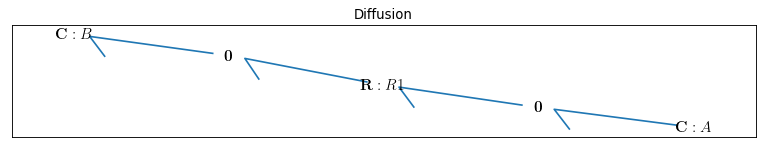
Fig. 4.36 Bondgraph diagram representing Diffusion
Now that the bond graph demonstration of the system is done, we can illustrate its behaviour during a specific time interval and with arbitrary initial conditions for the state variables. The constitutive relations of the model can be shown as well:
model.state_vars
Out[ ]: {'x_0': (C: A, 'q_0'), 'x_1': (C: B, 'q_0')}
==>
model.constitutive_relations
Out[ ]: [dx_0 + 10527217*u_0*x_0/2000 - 19018259*u_0*x_1/5000,
dx_1 - 10527217*u_0*x_0/2000 + 19018259*u_0*x_1/5000]
By using the command “bgt.simulate” and entering the model, time interval, and the initial conditions one can plot the time behaviour of the system. x vs t can be plotted by importing “matplotlib.pyplot” (\({q}_{Ce_A}\) & \({q}_{Ce_B}\) are state variables of the system which represent the molar amount in each solute):
import matplotlib.pyplot as plt
x0 = {"x_0":1, "x_1":0}
t_span = [0,3]

for c, kappa, label in [('r', 0.00019926, 'kappa=0.00019926'), ('b', 0.00053004, 'kappa=0.00053004'), ('g', 0.001,'kappa=0.001')]:
    t, x = bgt.simulate(model, x0=x0, timespan=t_span, control_vars={"u_0":kappa})
    plt.plot(t,x[:,0], c, label=label)
    plt.title('"Solute A"')
    plt.xlabel("time (s)")
    plt.ylabel("molar amount (mol/m3)")
    plt.legend(loc='upper right')
    plt.grid()
Three different amounts for the control variable (kappa) are considered to show its impact on the molar amount of each solute during the diffusion.
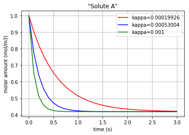
Fig. 4.37 Molar amount of solute A during diffusion with 3 different amounts for ‘kappa’
The same method can be manipulated to plot the molar amount of solute B vs time:
for c, kappa, label in [('r', 0.00019926, 'kappa=0.00019926'), ('b', 0.00053004, 'kappa=0.00053004'), ('g', 0.001,'kappa=0.001')]:
    t, x = bgt.simulate(model, x0=x0, timespan=t_span, control_vars={"u_0":kappa})
    plt.plot(t,x[:,1], c+':', label=label)
    plt.title('"Solute B"')
    plt.xlabel("time (s)")
    plt.ylabel("molar amount (mol/m3)")
    plt.legend(loc='lower right')
    plt.grid()
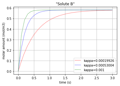
Fig. 4.38 Molar amount of solute B during diffusion with 3 different amounts for ‘kappa’
Since the molar concentration flow rate (\(v\)) of a solute is the time derivative of q:
it can be plotted by converting the considered state variable (either x[:,0] or x[:,1]) to an array by importing the numpy library and then calculating its gradient with 0.1 steps:
# Calculating the molar concentration flow rate of both the solutes
#  dq_Ce_A/dt = v_Ce_A (flow in the Ce_A)
#  dq_Ce_B/dt = v_Ce_B (flow in the Ce_B)

import matplotlib.pyplot as plt
import numpy as np
for c, kappa, title in [('r', 0.00019926, 'kappa=0.00019926'), ('b', 0.00053004, 'kappa=0.00053004'), ('g', 0.001,'kappa=0.001')]:
    t, x = bgt.simulate(model, x0=x0, timespan=t_span, control_vars={"u_0":kappa})
    f = np.array(x[:,0], dtype=float)
    v_Ce_A=np.gradient(f,0.1)

    f = np.array(x[:,1], dtype=float)
    slope=np.gradient(f,0.1)
    v_Ce_B=slope
Plotting the molar concentration flow rates of the two solutes:
plt.plot(t,v_Ce_A, c, label='v_Ce_A')
plt.plot(t,v_Ce_B, c+':', label='v_Ce_B')
leg1=plt.legend(loc='upper right')
plt.xlabel("time (s)")
plt.ylabel("molar concentration flow rate (mol/m3/s)")
plt.title(title)
plt.grid()
plt.show()
Each of the three following figures are plotted with a different amount for the variable ‘kappa’. The molar concentration flow rate of the both solutes (A & B) is depicted in each figure:
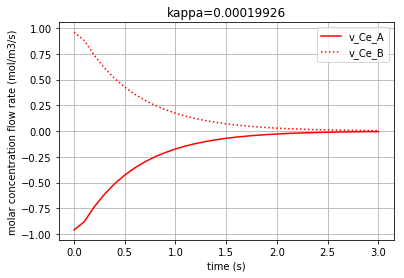
Fig. 4.39 Molar concentration flow rate of solute A & B with kappa=0.00019926.
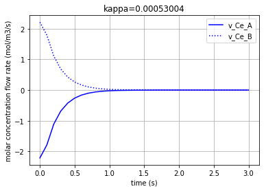
Fig. 4.40 Molar concentration flow rate of solute A & B with kappa=0.00053004.
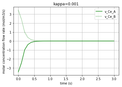
Fig. 4.41 Molar concentration flow rate of solute A & B with kappa=0.001.
Moreover, the chemical potential in each solute can be calculated based on its constitutive equations:
Solute: \(u=R.T.ln(K_{s}.q)\)
where \(u\) is the chemical potential of the solute, \(K_{s}\) is the species thermodynamic constant, and \(q\) is the molar concentration.
Thus, by choosing kappa=0.00019926 as a sample constant for the simulation:
# Calculating & plotting the solutes chemical potential (u_Ce_A & u_Ce_B)
# u=R.T.ln(K.q)
# for kappa=0.00019926

kappa=0.00019926
import math

t, x = bgt.simulate(model, x0=x0, timespan=t_span, control_vars={"u_0":kappa})

q_Ce_A = np.array(x[:,0], dtype=float)
u_Ce_A=R*T*np.log(K_A*q_Ce_A)


q_Ce_B = np.array(x[:,1], dtype=float)
u_Ce_B=R*T*np.log(K_B*q_Ce_B)
The time variation of the corresponding chemical potential for each solute (\(u_{Ce_A}\) & \(u_{Ce_B}\)) can be both plotted in a figure:
plt.plot(t,u_Ce_A, 'm', label='u_Ce_A')
plt.plot(t,u_Ce_B, 'c', label='u_Ce_B')
plt.legend(loc='upper right')
plt.xlabel("time (s)")
plt.ylabel("Chemical potential (J/mol)")
plt.title('Chemical potential of the solutes')
plt.grid()
which results in:
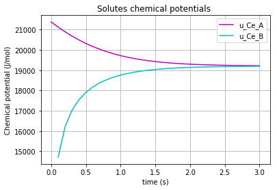
Fig. 4.42 Chemical potential of each solute (A & B) vs time
4.2.3.2. Simple Reaction
The definitions in this document are adopted from [2]

Fig. 4.43 Schematic of Simple Reaction
The rationale behind the following codes are explained thoroughly in “Diffusion” documentation.
import BondGraphTools as bgt
model = bgt.new(name="Simple Reaction")
K_A=50
K_B=20
K_C=10
K_D=5

Ce_A = bgt.new("Ce", name="A", library="BioChem", value={'k':K_A , 'R':8.314, 'T':300})
Ce_B= bgt.new("Ce", name="B", library="BioChem", value={'k':K_B, 'R':8.314, 'T':300})
Ce_C= bgt.new("Ce", name="C", library="BioChem", value={'k':K_C, 'R':8.314, 'T':300})
Ce_D= bgt.new("Ce", name="D", library="BioChem", value={'k':K_D, 'R':8.314, 'T':300})
reaction = bgt.new("Re", library="BioChem", value={'r':None, 'R':8.314, 'T':300})

A_junction = bgt.new("0")
B_junction = bgt.new("0")
C_junction = bgt.new("0")
D_junction = bgt.new("0")

one_junction_1 = bgt.new("1")
one_junction_2 = bgt.new("1")

bgt.add(model, Ce_A, Ce_B, Ce_C, Ce_D, A_junction, B_junction, C_junction, D_junction, one_junction_1, one_junction_2, reaction)
bgt.connect(Ce_A, A_junction)
bgt.connect(A_junction, one_junction_1)
bgt.connect(Ce_B, B_junction)
bgt.connect(B_junction, one_junction_1)
bgt.connect(one_junction_1, reaction)
bgt.connect(reaction, one_junction_2)
bgt.connect(one_junction_2, C_junction)
bgt.connect(C_junction, Ce_C)
bgt.connect(one_junction_2, D_junction)
bgt.connect(D_junction, Ce_D)
The reaction rate ‘r’ is set to “None” in order to change it inside a for loop.
By drawing the model, one can see if the components are connected properly to each other or not:
bgt.draw(model)
A sketch of the network will then be produced:
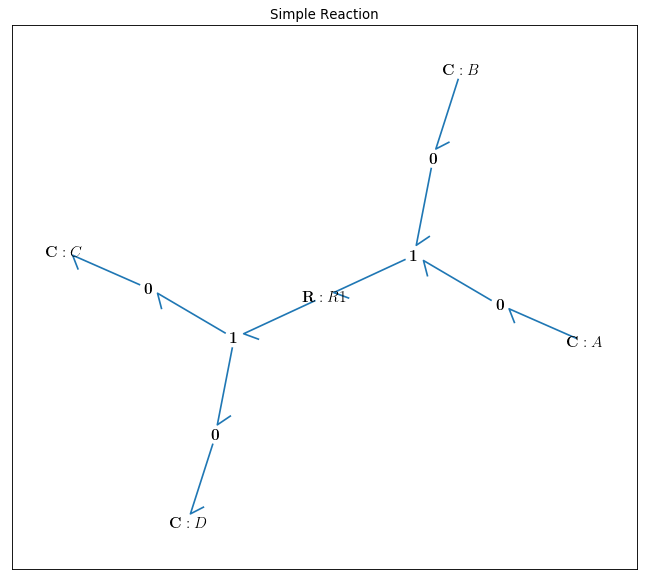
Fig. 4.44 Bondgraph diagram representing Simple Reaction
Now that the bond graph demonstration of the system is done, we can illustrate its behaviour during a specific time interval and with arbitrary initial conditions for the state variables. The constitutive relations of the model can be shown as well:
model.state_vars
Out[ ]: {'x_0': (C: A, 'q_0'),
'x_1': (C: B, 'q_0'),
'x_2': (C: C, 'q_0'),
'x_3': (C: D, 'q_0')}
==>
model.constitutive_relations
Out[ ]: [dx_0 + 1000*u_0*x_0*x_1 - 50*u_0*x_2*x_3,
dx_1 + 1000*u_0*x_0*x_1 - 50*u_0*x_2*x_3,
dx_2 - 1000*u_0*x_0*x_1 + 50*u_0*x_2*x_3,
dx_3 - 1000*u_0*x_0*x_1 + 50*u_0*x_2*x_3]
By using the command “bgt.simulate” and entering the model, time interval, and the initial conditions one can plot the time behaviour of the system. x vs t can be plotted by importing “matplotlib.pyplot” (\({q}_{Ce_A}\) & \({q}_{Ce_B}\) & \({q}_{Ce_C}\) & \({q}_{Ce_D}\) are state variables of the system which represent the molar amount in each solute):
import matplotlib.pyplot as plt
x0 = {"x_0":1, "x_1":1, "x_2":0, "x_3":0}
t_span = [0,6]

for c, kappa, label in [('r', 0.0005, 'kappa=0.0005'), ('b', 0.001, 'kappa=0.001'), ('g', 0.01,'kappa=0.01')]:
    t, x = bgt.simulate(model, x0=x0, timespan=t_span, control_vars={"u_0":kappa})
    plt.plot(t,x[:,0], c, label=label)
    plt.title('"Solute A & B"')
    plt.xlabel("time (s)")
    plt.ylabel("molar amount (mol/m3)")
    plt.legend(loc='upper right')
    plt.grid()
plt.show()


for c, kappa, label in [('r', 0.0005, 'kappa=0.0005'), ('b', 0.001, 'kappa=0.001'), ('g', 0.01,'kappa=0.01')]:
    t, x = bgt.simulate(model, x0=x0, timespan=t_span, control_vars={"u_0":kappa})
    plt.plot(t,x[:,2], c, label=label)
    plt.title('"Solute C & D"')
    plt.xlabel("time (s)")
    plt.ylabel("molar amount (mol/m3)")
    plt.legend(loc='upper right')
    plt.grid()
plt.show()
Three different amounts for the control variable (kappa) are considered to show its impact on the molar amount of each solute during the reaction period. Also, since the pairs {\({q}_{Ce_A}\) & \({q}_{Ce_B}\)} and {\({q}_{Ce_C}\) & \({q}_{Ce_D}\)} are identical in amounts, just two figures are plotted.
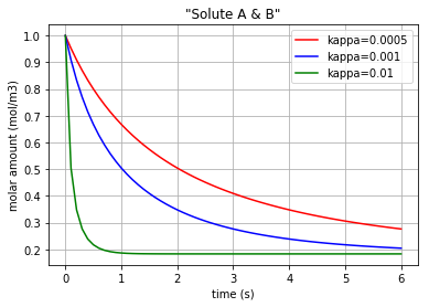
Fig. 4.45 Molar amount of solutes A & B during a simple reaction with 3 different amounts for ‘kappa’
Fig. 4.46 Molar amount of solutes C & D during a simple reaction with 3 different amounts for ‘kappa’
Since the molar concentration flow rate (\(v\)) of a solute is the time derivative of q:
it can be plotted by converting the considered state variable (either x[:,0], x[:,1], x[:,2] or x[:,3]) to an array by importing the numpy library and then calculating its gradient with 0.1 steps:
# Calculating the molar concentration flow rate of the solutes
#  dq_Ce_A/dt = v_Ce_A (flow in the Ce_A)
#  dq_Ce_B/dt = v_Ce_B (flow in the Ce_B)
#  dq_Ce_C/dt = v_Ce_C (flow in the Ce_C)
#  dq_Ce_D/dt = v_Ce_D (flow in the Ce_D)

import matplotlib.pyplot as plt
import numpy as np
for c, kappa, title in [('r', 0.0005, 'kappa=0.0005'), ('b', 0.001, 'kappa=0.001'), ('g', 0.01,'kappa=0.01')]:
    t, x = bgt.simulate(model, x0=x0, timespan=t_span, control_vars={"u_0":kappa})
    f = np.array(x[:,0], dtype=float)
    v_Ce_A=np.gradient(f,0.1)

    f = np.array(x[:,1], dtype=float)
    slope=np.gradient(f,0.1)
    v_Ce_B=slope

    f = np.array(x[:,2], dtype=float)
    slope=np.gradient(f,0.1)
    v_Ce_C=slope

    f = np.array(x[:,3], dtype=float)
    slope=np.gradient(f,0.1)
    v_Ce_D=slope
Plotting the molar concentration flow rates of the solutes for three different amounts of kappa:
plt.plot(t,v_Ce_A, c, label='v_Ce_A & v_Ce_B')        # v_Ce_A & v_Ce_B have the same amounts
plt.plot(t,v_Ce_C, c+'*', label='v_Ce_C & v_Ce_D')    # v_Ce_C & v_Ce_D have the same amounts

leg1=plt.legend(loc='upper right')
plt.xlabel("time (s)")
plt.ylabel("molar concentration flow rate (mol/m3/s)")
plt.title(title)
plt.grid()
plt.show()
Again note that since the amounts for the pairs {\(v_{Ce_A}\) & \(v_{Ce_B}\)} and {\(v_{Ce_C}\) & \(v_{Ce_D}\)} are equal, we have just demonstrated one figure representing each pair. Each of the three following figures are plotted with a different amount for the variable ‘kappa’. The molar concentration flow rate of each pair of solutes is depicted in each figure:
Fig. 4.47 Molar concentration flow rate of solute A & B with kappa=0.0005.
Fig. 4.48 Molar concentration flow rate of solute A & B with kappa=0.001.
Fig. 4.49 Molar concentration flow rate of solute A & B with kappa=0.01.
Moreover, the chemical potential in each solute can be calculated based on its constitutive equations:
Solute: \(u=R.T.ln(K_{s}.q)\)
where \(u\) is the chemical potential of the solute [\(J/mol\)], \(K_{s}\) is the species thermodynamic constant [\(mol^{-1}\)], R is the ideal gas constant [\(J/K/mol\)], T is the absolute temperature [\(K\)] and \(q\) is the molar concentration [4].
Thus, the \(u\) in each solute is calculated for a sample reaction rate of kappa=0.001:
# Calculating & plotting the solutes chemical potentials (u_Ce_A & u_Ce_B & u_Ce_C & u_Ce_D)
# for kappa=0.001

kappa=0.001
t, x = bgt.simulate(model, x0=x0, timespan=t_span, control_vars={"u_0":kappa})

q_Ce_A = np.array(x[:,0], dtype=float)
u_Ce_A=R*T*np.log(K_A*q_Ce_A)

q_Ce_B = np.array(x[:,1], dtype=float)
u_Ce_B=R*T*np.log(K_B*q_Ce_B)

q_Ce_C = np.array(x[:,2], dtype=float)
u_Ce_C=R*T*np.log(K_C*q_Ce_C)

q_Ce_D = np.array(x[:,3], dtype=float)
u_Ce_D=R*T*np.log(K_D*q_Ce_D)
The time variation of the corresponding chemical potential for each solute (\(u_{Ce_A}\) & \(u_{Ce_B}\) & \(u_{Ce_C}\) & \(u_{Ce_D}\)) can be both plotted in a figure:
plt.plot(t,u_Ce_A, 'm', label='u_Ce_A')
plt.plot(t,u_Ce_B, 'c', label='u_Ce_B')
plt.plot(t,u_Ce_C, 'y', label='u_Ce_C')
plt.plot(t,u_Ce_D, 'k', label='u_Ce_D')
plt.legend(loc='upper right')
plt.xlabel("time (s)")
plt.ylabel("Chemical potential (J/mol)")
plt.title('Chemical potential of the solutes')
plt.grid()
which results in:
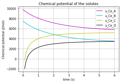
Fig. 4.50 Chemical potential of each solute (A,B,C,D) vs time
* Note the differences which the “K”s make in the chemical potential of the solutes (\(K_{A}\), \(K_{B}\), \(K_{C}\), \(K_{D}\)).
4.2.3.3. Enzyme Catalysed Reaction #1
The definitions in this document are adopted from [2] and [5] .

Fig. 4.51 Schematic of Enzyme Catalysed Reaction #1
The rationale behind the following codes are explained thoroughly in “Diffusion” and “Simple reaction” documentation.
import BondGraphTools as bgt
model = bgt.new(name="Enzyme catalysed Reaction")
K_A=50
K_E=1
K_B=5

R=8.314
T=300

Ce_A = bgt.new("Ce", name="A", library="BioChem", value={'k':K_A , 'R':R, 'T':T})
Ce_B= bgt.new("Ce", name="B", library="BioChem", value={'k':K_B, 'R':R, 'T':T})
Ce_E= bgt.new("Ce", name="E", library="BioChem", value={'k':K_E, 'R':R, 'T':T})

reaction = bgt.new("Re", library="BioChem", value={'r':None, 'R':R, 'T':T})

zero_junction = bgt.new("0")
one_junction_1 = bgt.new("1")
one_junction_2 = bgt.new("1")

bgt.add(model, Ce_A, Ce_B, Ce_E, zero_junction, one_junction_1, one_junction_2, reaction)

bgt.connect(Ce_A,one_junction_1)
bgt.connect(one_junction_1,reaction)
bgt.connect(reaction,one_junction_2)
bgt.connect(one_junction_2,Ce_B)
bgt.connect(zero_junction,one_junction_1)
bgt.connect(zero_junction,Ce_E)
bgt.connect(one_junction_2,zero_junction)
The reaction rate ‘r’ is set to “None” in order to change it inside a for loop.
By drawing the model, one can see if the components are connected properly to each other or not:
bgt.draw(model)
A sketch of the network will then be produced:
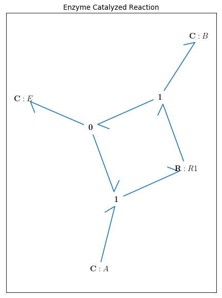
Fig. 4.52 Bondgraph diagram representing Enzyme Catalysed Reaction #1
Now that the bond graph demonstration of the system is done, we can illustrate its behaviour during a specific time interval and with arbitrary initial conditions for the state variables. The constitutive relations of the model can be shown as well:
model.state_vars
Out[ ]: {'x_0': (C: A, 'q_0'),
'x_1': (C: B, 'q_0'),
'x_2': (C: E, 'q_0')}
==>
model.constitutive_relations
Out[ ]: [dx_0 + 50*u_0*x_0*x_2 - 5*u_0*x_1*x_2,
dx_1 - 50*u_0*x_0*x_2 + 5*u_0*x_1*x_2,
dx_2]
By using the command “bgt.simulate” and entering the model, time interval, and the initial conditions one can plot the time behaviour of the system. x vs t can be plotted by importing “matplotlib.pyplot” (\({q}_{Ce_A}\) & \({q}_{Ce_B}\) & \({q}_{Ce_E}\) are state variables of the system which represent the molar amount in each solute/enzyme):
import matplotlib.pyplot as plt
x0 = {"x_0":1, "x_1":0.001, "x_2":1}
t_span = [0,10]

for c, kappa, label in [('r', 0.005, 'kappa=0.005'), ('b', 0.01, 'kappa=0.01'), ('g', 0.1,'kappa=0.1')]:
    t, x = bgt.simulate(model, x0=x0, timespan=t_span, control_vars={"u_0":kappa})
    plt.plot(t,x[:,0], c, label=label)
    plt.title('"Solute A"')
    plt.xlabel("time (s)")
    plt.ylabel("molar amount (mol/m3)")
    plt.legend(loc='upper right')
    plt.grid()
plt.show()


for c, kappa, label in [('r', 0.005, 'kappa=0.005'), ('b', 0.01, 'kappa=0.01'), ('g', 0.1,'kappa=0.1')]:
    t, x = bgt.simulate(model, x0=x0, timespan=t_span, control_vars={"u_0":kappa})
    plt.plot(t,x[:,1], c, label=label)
    plt.title('"Solute B"')
    plt.xlabel("time (s)")
    plt.ylabel("molar amount (mol/m3)")
    plt.legend(loc='upper right')
    plt.grid()
plt.show()

for c, kappa, label in [('r', 0.005, 'kappa=0.005'), ('b', 0.01, 'kappa=0.01'), ('g', 0.1,'kappa=0.1')]:
    t, x = bgt.simulate(model, x0=x0, timespan=t_span, control_vars={"u_0":kappa})
    plt.plot(t,x[:,2], c, label=label)
    plt.title('"Enzyme"')
    plt.xlabel("time (s)")
    plt.ylabel("molar amount (mol/m3)")
    plt.legend(loc='upper right')
    plt.grid()
plt.show()
Three different amounts for the control variable (kappa) are considered to show its impact on the molar amount of each solute/enzyme during the reaction period.
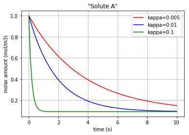
Fig. 4.53 Molar amount of solute A during an enzyme catalysed reaction with 3 different amounts for ‘kappa’
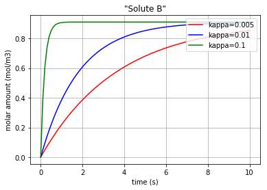
Fig. 4.54 Molar amount of solute B during an enzyme catalysed reaction with 3 different amounts for ‘kappa’
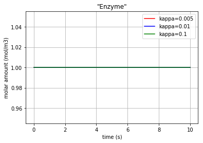
Fig. 4.55 Molar amount of the enzyme E during an enzyme catalysed reaction with 3 different amounts for ‘kappa’
* Note that since the enzyme E is neither produced nor consumed, its molar amount is remained constant.
The molar concentration flow rate (\(v\)) of a solute is the time derivative of q:
and it can be plotted by converting the considered state variable (either x[:,0], x[:,1] or x[:,2]) to an array by importing the numpy library and then calculating its gradient with 0.1 steps:
import matplotlib.pyplot as plt
import numpy as np
for c, kappa, title in [('r', 0.005, 'kappa=0.005'), ('b', 0.01, 'kappa=0.01'), ('g', 0.1,'kappa=0.1')]:
    t, x = bgt.simulate(model, x0=x0, timespan=t_span, control_vars={"u_0":kappa})
    f = np.array(x[:,0], dtype=float)
    v_Ce_A=np.gradient(f,0.1)

    f = np.array(x[:,1], dtype=float)
    slope=np.gradient(f,0.1)
    v_Ce_B=slope

    f = np.array(x[:,2], dtype=float)
    slope=np.gradient(f,0.1)
    v_Ce_E=slope
Plotting the molar concentration flow rates of the solutes for three different amounts of kappa:
plt.plot(t,v_Ce_A, c, label='v_Ce_A')
plt.plot(t,v_Ce_B, c+':', label='v_Ce_B')
plt.plot(t,v_Ce_E, c+'*', label='v_Ce_E')

leg1=plt.legend(loc='upper right')
plt.xlabel("time (s)")
plt.ylabel("molar concentration flow rate (mol/m3/s)")
plt.title(title)
plt.grid()
plt.show()
Each of the three following figures are plotted with a different amount for the variable ‘kappa’. The molar concentration flow rate of each solute/enzyme is depicted in each figure:
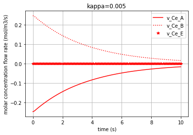
Fig. 4.56 Molar concentration flow rate of solutes A & B and the enzyme E with kappa=0.005.
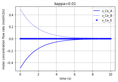
Fig. 4.57 Molar concentration flow rate of solutes A & B and the enzyme E with kappa=0.01.
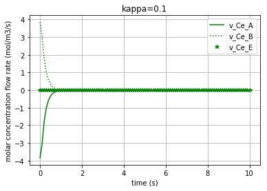
Fig. 4.58 Molar concentration flow rate of solutes A & B and the enzyme E with kappa=0.1.
Moreover, the chemical potential in each solute/enzyme can be calculated based on its constitutive equations:
Solute: \(u=R.T.ln(K_{s}.q)\)
where \(u\) is the chemical potential of the solute [\(J/mol\)], \(K_{s}\) is the species thermodynamic constant [\(mol^{-1}\)], R is the ideal gas constant [\(J/K/mol\)], T is the absolute temperature [\(K\)] and \(q\) is the molar concentration [4].
Thus, the \(u\) in each solute is calculated for a sample reaction rate of kappa=0.01:
kappa=0.01
t, x = bgt.simulate(model, x0=x0, timespan=t_span, control_vars={"u_0":kappa})

q_Ce_A = np.array(x[:,0], dtype=float)
u_Ce_A=R*T*np.log(K_A*q_Ce_A)

q_Ce_B = np.array(x[:,1], dtype=float)
u_Ce_B=R*T*np.log(K_B*q_Ce_B)

q_Ce_E = np.array(x[:,2], dtype=float)
u_Ce_E=R*T*np.log(K_E*q_Ce_E)
The time variation of the corresponding chemical potential for each solute/enzyme (\(u_{Ce_A}\) & \(u_{Ce_B}\) & \(u_{Ce_E}\) ) can be all plotted in a figure:
plt.plot(t,u_Ce_A, 'm', label='u_Ce_A')
plt.plot(t,u_Ce_B, 'c', label='u_Ce_B')
plt.plot(t,u_Ce_E, 'k', label='u_Ce_E')
plt.legend(loc='upper right')
plt.xlabel("time (s)")
plt.ylabel("Chemical potential (J/mol)")
plt.title('Chemical potential of the solutes')
plt.grid()
which results in:
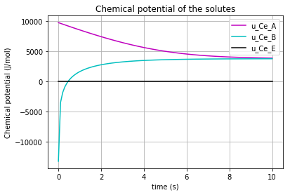
Fig. 4.59 Chemical potential of each solute/enzyme (A,B,E) vs time
At this stage we would like to demonstrate the relation between the molar amount of the substrate “A” and the molar flow rate of producing the product “B”. * Note that by the declining of the molar amount of the substrate “A”, the production rate of “B” reduces:
plt.plot(q_Ce_A,v_Ce_B,'*-r')
plt.xlabel("molar amount of solute A (mol/m3)")
plt.ylabel("molar concentration flow rate of solute B (mol/m3/s)")
plt.grid()
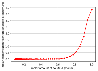
Fig. 4.60 Molar concentration flow rate of solute B vs the molar amount of solute A
4.2.3.4. Enzyme Catalysed Reaction #2
The definitions in this document are adopted from [2] and [5] .

Fig. 4.61 Schematic of Enzyme Catalysed Reaction #2
The rationale behind the following codes are explained thoroughly in “Diffusion” and “Simple reaction” documentation.
import BondGraphTools as bgt
model = bgt.new(name="Enzyme catalysed Reaction 2")
K_A=20
K_B=20
K_E=1
K_C=20

R=8.314
T=300

Ce_A = bgt.new("Ce", name="A", library="BioChem", value={'k':K_A , 'R':R, 'T':T})
Ce_B= bgt.new("Ce", name="B", library="BioChem", value={'k':K_B, 'R':R, 'T':T})
Ce_E= bgt.new("Ce", name="E", library="BioChem", value={'k':K_E, 'R':R, 'T':T})
Ce_C= bgt.new("Ce", name="C", library="BioChem", value={'k':K_C, 'R':R, 'T':T})


reaction_1 = bgt.new("Re", library="BioChem", value={'r':None, 'R':R, 'T':T})
reaction_2 = bgt.new("Re", library="BioChem", value={'r':None, 'R':R, 'T':T})


zero_junction_1 = bgt.new("0")
zero_junction_2 = bgt.new("0")

one_junction_1 = bgt.new("1")
one_junction_2 = bgt.new("1")

bgt.add(model, Ce_A, Ce_B, Ce_E,Ce_C, zero_junction_1, zero_junction_2,
   one_junction_1, one_junction_2, reaction_1, reaction_2)

bgt.connect(Ce_A,one_junction_1)
bgt.connect(one_junction_1,reaction_1)
bgt.connect(reaction_1,zero_junction_1)
bgt.connect(zero_junction_1,Ce_B)
bgt.connect(zero_junction_1,reaction_2)
bgt.connect(reaction_2,one_junction_2)
bgt.connect(one_junction_2,Ce_C)
bgt.connect(one_junction_2,zero_junction_2)
bgt.connect(zero_junction_2,Ce_E)
bgt.connect(zero_junction_2,one_junction_1)
The reactions rate ‘r’ is set to “None” in order to change it inside a for loop.
By drawing the model, one can see if the components are connected properly to each other or not:
bgt.draw(model)
A sketch of the network will then be produced:
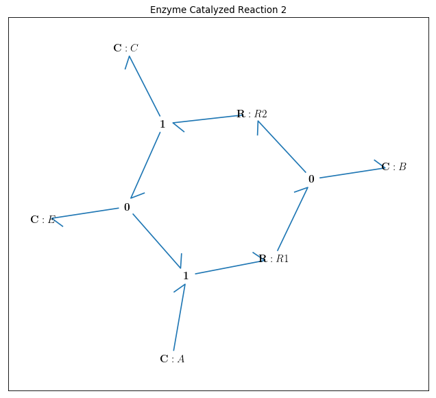
Fig. 4.62 Bondgraph diagram representing Enzyme Catalysed Reaction #2
Now that the bond graph demonstration of the system is done, we can illustrate its behaviour during a specific time interval and with arbitrary initial conditions for the state variables. The constitutive relations of the model can be shown as well:
model.state_vars
Out[ ]: {'x_0': (C: A, 'q_0'),
'x_1': (C: B, 'q_0'),
'x_2': (C: E, 'q_0'),
'x_3': (C: C, 'q_0')}
==>
model.constitutive_relations
Out[ ]: [dx_0 + 20*u_0*x_0*x_2 - 20*u_0*x_1,
dx_1 - 20*u_0*x_0*x_2 + 20*u_0*x_1 + 20*u_1*x_1 - 20*u_1*x_2*x_3,
dx_2 + 20*u_0*x_0*x_2 - 20*u_0*x_1 - 20*u_1*x_1 + 20*u_1*x_2*x_3,
dx_3 - 20*u_1*x_1 + 20*u_1*x_2*x_3]
By using the command “bgt.simulate” and entering the model, time interval, and the initial conditions one can plot the time behaviour of the system. x vs t can be plotted by importing “matplotlib.pyplot” (\({q}_{Ce_A}\) & \({q}_{Ce_B}\) & \({q}_{Ce_C}\) & \({q}_{Ce_E}\) are state variables of the system which represent the molar amount in each solute/enzyme):
import matplotlib.pyplot as plt
x0 = {"x_0":1, "x_1":1, "x_2":1, "x_3":0.001}
t_span = [0,10]

for c, kappa, label in [('r', 0.005, 'kappa=0.005'), ('b', 0.01, 'kappa=0.01'), ('g', 0.1,'kappa=0.1')]:
    t, x = bgt.simulate(model, x0=x0, timespan=t_span, control_vars={"u_0":kappa, "u_1":kappa})
    plt.plot(t,x[:,0], c, label=label)
    plt.title('"Solute A"')
    plt.xlabel("time (s)")
    plt.ylabel("molar amount (mol/m3)")
    plt.legend(loc='upper right')
    plt.grid()
plt.show()


for c, kappa, label in [('r', 0.005, 'kappa=0.005'), ('b', 0.01, 'kappa=0.01'), ('g', 0.1,'kappa=0.1')]:
    t, x = bgt.simulate(model, x0=x0, timespan=t_span, control_vars={"u_0":kappa, "u_1":kappa})
    plt.plot(t,x[:,1], c, label=label)
    plt.title('"Solute B"')
    plt.xlabel("time (s)")
    plt.ylabel("molar amount (mol/m3)")
    plt.legend(loc='upper right')
    plt.grid()
plt.show()

for c, kappa, label in [('r', 0.005, 'kappa=0.005'), ('b', 0.01, 'kappa=0.01'), ('g', 0.1,'kappa=0.1')]:
    t, x = bgt.simulate(model, x0=x0, timespan=t_span, control_vars={"u_0":kappa, "u_1":kappa})
    plt.plot(t,x[:,2], c, label=label)
    plt.title('"Enzyme"')
    plt.xlabel("time (s)")
    plt.ylabel("molar amount (mol/m3)")
    plt.legend(loc='upper right')
    plt.grid()
plt.show()

for c, kappa, label in [('r', 0.005, 'kappa=0.005'), ('b', 0.01, 'kappa=0.01'), ('g', 0.1,'kappa=0.1')]:
    t, x = bgt.simulate(model, x0=x0, timespan=t_span, control_vars={"u_0":kappa, "u_1":kappa})
    plt.plot(t,x[:,3], c, label=label)
    plt.title('"Solute C"')
    plt.xlabel("time (s)")
    plt.ylabel("molar amount (mol/m3)")
    plt.legend(loc='upper right')
    plt.grid()
plt.show()
Three different amounts for the control variable (kappa) are considered to show its impact on the molar amount of each solute/enzyme during the reaction period.
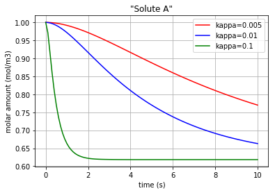
Fig. 4.63 Molar amount of solute A during an enzyme catalysed reaction with 3 different amounts for ‘kappa’
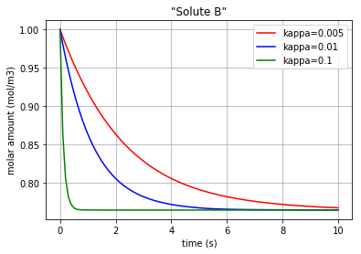
Fig. 4.64 Molar amount of solute B during an enzyme catalysed reaction with 3 different amounts for ‘kappa’
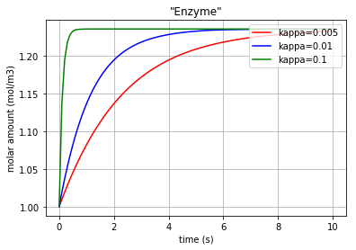
Fig. 4.65 Molar amount of the enzyme E during an enzyme catalysed reaction with 3 different amounts for ‘kappa’
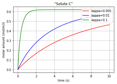
Fig. 4.66 Molar amount of solute C during an enzyme catalysed reaction with 3 different amounts for ‘kappa’
* Note that since the enzyme E is now both produced and consumed.
The molar concentration flow rate (\(v\)) of a solute is the time derivative of q:
and it can be plotted by converting the considered state variable (either x[:,0], x[:,1], x[:,2] or x[:,3]) to an array by importing the numpy library and then calculating its gradient with 0.1 steps. The kappa=0.02 is chosen for a better distinction:
import matplotlib.pyplot as plt
import numpy as np
kappa=0.02
t, x = bgt.simulate(model, x0=x0, timespan=t_span, control_vars={"u_0":kappa, "u_1":kappa})
f = np.array(x[:,0], dtype=float)
v_Ce_A=np.gradient(f,0.1)

f = np.array(x[:,1], dtype=float)
slope=np.gradient(f,0.1)
v_Ce_B=slope

f = np.array(x[:,2], dtype=float)
slope=np.gradient(f,0.1)
v_Ce_E=slope

f = np.array(x[:,3], dtype=float)
slope=np.gradient(f,0.1)
v_Ce_C=slope
Plotting the molar concentration flow rates of the solutes/enzyme for kappa=0.02:
plt.plot(t,v_Ce_A, 'r', label='v_Ce_A')
plt.plot(t,v_Ce_B, 'b', label='v_Ce_B')
plt.plot(t,v_Ce_C, 'c', label='v_Ce_C')
plt.plot(t,v_Ce_E, 'k', label='v_Ce_E')

leg1=plt.legend(loc='upper right')
plt.xlabel("time (s)")
plt.ylabel("molar concentration flow rate (mol/m3/s)")
plt.title('kappa=0.02')
plt.grid()
plt.show()
The molar concentration flow rate of each solute/enzyme is depicted in the following figure:
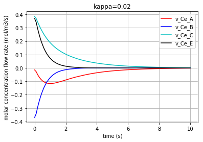
Fig. 4.67 Molar concentration flow rate of solutes A & B & C and the enzyme E with kappa=0.02.
Moreover, the chemical potential in each solute/enzyme can be calculated based on its constitutive equations:
Solute: \(u=R.T.ln(K_{s}.q)\)
where \(u\) is the chemical potential of the solute [\(J/mol\)], \(K_{s}\) is the species thermodynamic constant [\(mol^{-1}\)], R is the ideal gas constant [\(J/K/mol\)], T is the absolute temperature [\(K\)] and \(q\) is the molar concentration [4].
Thus, the \(u\) in each solute/enzyme is calculated for a sample reaction rate of kappa=0.02:
kappa=0.02
t, x = bgt.simulate(model, x0=x0, timespan=t_span, control_vars={"u_0":kappa, "u_1":kappa})

q_Ce_A = np.array(x[:,0], dtype=float)
u_Ce_A=R*T*np.log(K_A*q_Ce_A)

q_Ce_B = np.array(x[:,1], dtype=float)
u_Ce_B=R*T*np.log(K_B*q_Ce_B)

q_Ce_E = np.array(x[:,2], dtype=float)
u_Ce_E=R*T*np.log(K_E*q_Ce_E)

q_Ce_C = np.array(x[:,3], dtype=float)
u_Ce_C=R*T*np.log(K_C*q_Ce_C)
The time variation of the corresponding chemical potential for each solute/enzyme (\(u_{Ce_A}\) & \(u_{Ce_B}\) & \(u_{Ce_E}\) & \(u_{Ce_C}\) ) can be all plotted in a figure:
plt.plot(t,u_Ce_A, 'm', label='u_Ce_A')
plt.plot(t,u_Ce_B, 'c', label='u_Ce_B')
plt.plot(t,u_Ce_C, 'y', label='u_Ce_C')
plt.plot(t,u_Ce_E, 'k', label='u_Ce_E')
plt.legend(loc='lower right')
plt.xlabel("time (s)")
plt.ylabel("Chemical potential (J/mol)")
plt.title('Chemical potential of the solutes')
plt.grid()
which results in:
Fig. 4.68 Chemical potential of each solute/enzyme (A,B,C,E) vs time
At this stage we would like to demonstrate the relation between the molar amount of the substrate “A” and the molar flow rate of producing the product “C”. * Note that by the declining of the molar amount of the substrate “A”, the production rate of “C” reduces:
plt.plot(q_Ce_A,v_Ce_C, '*-g')
plt.xlabel("molar amount of solute A (mol/m3)")
plt.ylabel("molar concentration flow rate of solute C (mol/m3/s)")
plt.grid()
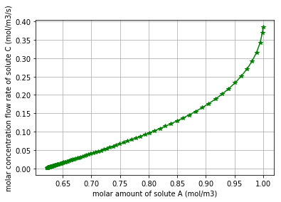
Fig. 4.69 Molar concentration flow rate of solute C vs the molar amount of solute A
4.2.3.5. Reaction with Mixed Stoichiometry
The definitions in this document are adopted from [2] and [5] .

Fig. 4.70 Schematic of Reaction with Mixed Stoichiometry.
The rationale behind the following codes are explained thoroughly in “Diffusion” and “Simple reaction” documentation.
import BondGraphTools as bgt
model = bgt.new(name="Reaction with mixed stoichiometry")
K_A=20
K_B=20
K_C=20
K_D=20

R=8.314
T=300

Ce_A = bgt.new("Ce", name="A", library="BioChem", value={'k':K_A , 'R':R, 'T':T})
Ce_B= bgt.new("Ce", name="B", library="BioChem", value={'k':K_B, 'R':R, 'T':T})
Ce_C= bgt.new("Ce", name="C", library="BioChem", value={'k':K_C, 'R':R, 'T':T})
Ce_D= bgt.new("Ce", name="D", library="BioChem", value={'k':K_D, 'R':R, 'T':T})

TF_1_ratio=0.5
TF_1=bgt.new("TF", value=TF_1_ratio)

TF_2_ratio=0.5
TF_2=bgt.new("TF", value=TF_2_ratio)


reaction = bgt.new("Re", library="BioChem", value={'r':None, 'R':R, 'T':T})

zero_junction_1 = bgt.new("0")
zero_junction_2 = bgt.new("0")
zero_junction_3 = bgt.new("0")
zero_junction_4 = bgt.new("0")

one_junction_1 = bgt.new("1")
one_junction_2 = bgt.new("1")

bgt.add(model, Ce_A, Ce_B, Ce_C, Ce_D, TF_1, TF_2, zero_junction_1, zero_junction_2, zero_junction_3, zero_junction_4, one_junction_1, one_junction_2, reaction)

bgt.connect(Ce_A, zero_junction_1)
bgt.connect(zero_junction_1,one_junction_1)
bgt.connect(Ce_B,zero_junction_2)
bgt.connect(zero_junction_2,(TF_1,0))
bgt.connect((TF_1,1),one_junction_1)
bgt.connect(one_junction_1,reaction)
bgt.connect(reaction,one_junction_2)
bgt.connect(one_junction_2,zero_junction_3)
bgt.connect(zero_junction_3,Ce_C)
bgt.connect(one_junction_2,(TF_2,0))
bgt.connect((TF_2,1),zero_junction_4)
bgt.connect(zero_junction_4,Ce_D)
The reaction rate ‘r’ is set to “None” in order to change it inside a for loop. * Note that when dealing with mixed stoichiometry in bond graphs, one must take the advantages of using the Transformer component (TF), while the TF is a power conserving transformation [4].
By drawing the model, one can see if the components are connected properly to each other or not:
bgt.draw(model)
A sketch of the network will then be produced:
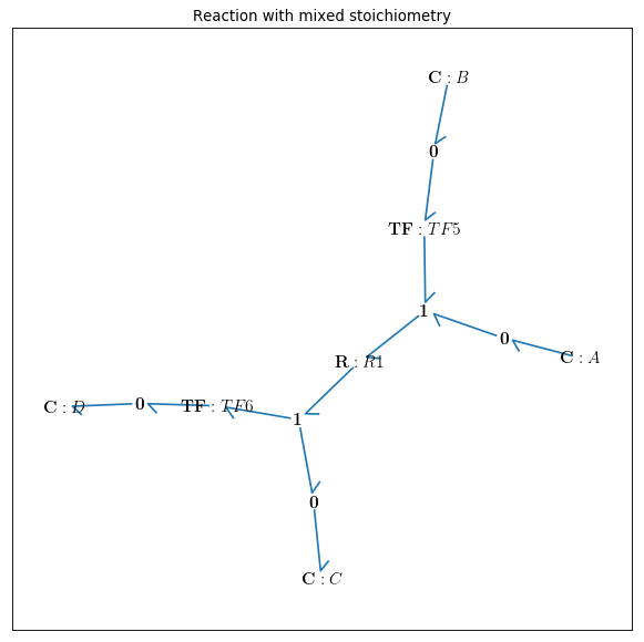
Fig. 4.71 Bondgraph diagram representing Reaction with Mixed Stoichiometry
Now that the bond graph demonstration of the system is done, we can illustrate its behaviour during a specific time interval and with arbitrary initial conditions for the state variables. The constitutive relations of the model can be shown as well:
model.state_vars
Out[ ]: {'x_0': (C: A, 'q_0'),
'x_1': (C: B, 'q_0'),
'x_2': (C: C, 'q_0'),
'x_3': (C: D, 'q_0')}
==>
model.constitutive_relations
Out[ ]: [dx_0 + 223606797749979*u_0*x_0*sqrt(x_1)/2500000000000 - 8000*u_0*x_2*x_3**2,
dx_1 + 223606797749979*u_0*x_0*sqrt(x_1)/5000000000000 - 4000*u_0*x_2*x_3**2,
dx_2 - 223606797749979*u_0*x_0*sqrt(x_1)/2500000000000 + 8000*u_0*x_2*x_3**2,
dx_3 - 178885438199983*u_0*x_0*sqrt(x_1)/1000000000000 + 16000*u_0*x_2*x_3**2]
By using the command “bgt.simulate” and entering the model, time interval, and the initial conditions one can plot the time behaviour of the system. x vs t can be plotted by importing “matplotlib.pyplot” (\({q}_{Ce_A}\) & \({q}_{Ce_B}\) & \({q}_{Ce_C}\) & \({q}_{Ce_D}\) are state variables of the system which represent the molar amount in each solute). Here kappa=0.001 is chosen for a better demonstration:
import matplotlib.pyplot as plt
x0 = {"x_0":1, "x_1":1, "x_2":0.001, "x_3":0.001}
t_span = [0,6]
kappa=0.001
t, x = bgt.simulate(model, x0=x0, timespan=t_span, control_vars={"u_0":kappa})

for c, i, label in [('r', 0, 'Solute A'), ('g', 1, 'Solute B'), ('b', 2, 'Solute C'), ('y', 3, 'Solute D')]:
    plt.plot(t,x[:,i], c, label=label)
plt.xlabel("time (s)")
plt.ylabel("molar amount (mol/m3)")
plt.legend(loc='center right')
plt.grid()
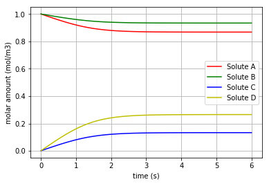
Fig. 4.72 Molar amount of the solutes A, B, C & D during a reaction with mixed stoichiometry for ‘kappa=0.001’
* Note that the final molar amounts of the solutes B & D are twice as much as the final molar amounts of the solutes A & C, respectively.
The molar concentration flow rate (\(v\)) of a solute is the time derivative of q:
and it can be plotted by converting the considered state variable (either x[:,0], x[:,1], x[:,2] or x[:,3]) to an array by importing the numpy library and then calculating its gradient with 0.1 steps:
import matplotlib.pyplot as plt
import numpy as np

for c, i, label in [('r', 0, 'v_Ce_A'), ('g', 1, 'v_Ce_B'), ('b', 2, 'v_Ce_C'), ('y', 3, 'v_Ce_D')]:
    f = np.array(x[:,i], dtype=float)
    slope=np.gradient(f,0.1)

    plt.plot(t,slope, c, label=label)

plt.legend(loc='upper right')
plt.xlabel("time (s)")
plt.ylabel("molar concentration flow rate (mol/m3/s)")
plt.grid()
plt.show()
The molar concentration flow rate of each solute is depicted in the following figure:
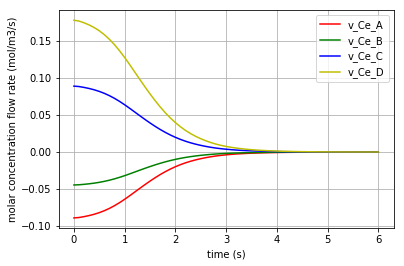
Fig. 4.73 Molar concentration flow rate of solutes A & B & C and D with kappa=0.001.
Moreover, the chemical potential in each solute can be calculated based on its constitutive equations:
Solute: \(u=R.T.ln(K_{s}.q)\)
where \(u\) is the chemical potential of the solute [\(J/mol\)], \(K_{s}\) is the species thermodynamic constant [\(mol^{-1}\)], R is the ideal gas constant [\(J/K/mol\)], T is the absolute temperature [\(K\)] and \(q\) is the molar concentration [4].
Thus, the \(u\) in each solute is calculated for a sample reaction rate of kappa=0.001. The time variation of the corresponding chemical potential for each solute (\(u_{Ce_A}\) & \(u_{Ce_B}\) & \(u_{Ce_C}\) & \(u_{Ce_D}\) ) can be all plotted in a figure:
for c, i, k, label in [('r',0,K_A,'u_Ce_A'), ('g',1,K_B,'u_Ce_B'), ('b',2,K_C,'u_Ce_C'), ('y',3,K_D,'u_Ce_D')]:
    q= np.array(x[:,i], dtype=float)
    u=R*T*np.log(k*q)
    plt.plot(t,u, c, label=label)

plt.legend(loc='lower right')
plt.xlabel("time (s)")
plt.ylabel("Chemical potential (J/mol)")
plt.title('Chemical potential of the solutes')
plt.grid()
which results in:
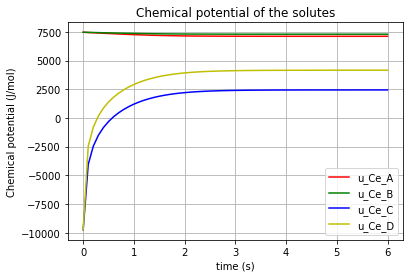
Fig. 4.74 Chemical potential of each solute (A,B,C,D) vs time
For scaling purpose, each pair of chemical potentials of the solutes [(A,B) , (C,D)] are plotted again the separate figures:
for c, i, k, label in [('r',0,K_A,'u_Ce_A'), ('g',1,K_B,'u_Ce_B')]:
    q= np.array(x[:,i], dtype=float)
    u=R*T*np.log(k*q)
    plt.plot(t,u, c, label=label)
plt.legend(loc='upper right')
plt.xlabel("time (s)")
plt.ylabel("Chemical potential (J/mol)")
plt.title('Chemical potential of the solutes')
plt.grid()
plt.show()

for c, i, k, label in [('b',2,K_C,'u_Ce_C'), ('y',3,K_D,'u_Ce_D')]:
    q= np.array(x[:,i], dtype=float)
    u=R*T*np.log(k*q)
    plt.plot(t,u, c, label=label)
plt.legend(loc='lower right')
plt.xlabel("time (s)")
plt.ylabel("Chemical potential (J/mol)")
plt.title('Chemical potential of the solutes')
plt.grid()
plt.show()
Then the comparison would be more straightforward:
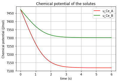
Fig. 4.75 Chemical potential of the solutes A & B vs time
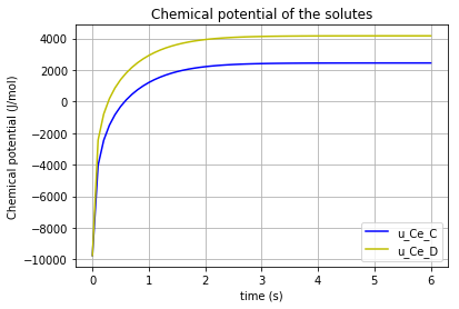
Fig. 4.76 Chemical potential of the solutes C & D vs time
Click to read Reaction with Mixed Stoichiometry codes
| [1] | (1, 2, 3) Cudmore, P., & Gawthrop, P. J., & Pan, M., & Crampin, E. J. (2019). Computer-aided modelling of complex physical systems with BondGraphTools. Click for the article |
| [2] | (1, 2, 3, 4, 5, 6, 7, 8, 9, 10) Hunter, P., & Safaei, S. (2017). Bond Graphs, CellML, ApiNATOMY & OpenCOR. Retrieved from here |
| [3] | (1, 2) Safaei S, Blanco PJ, Muller LO, Hellevik LR and Hunter PJ (2018) Bond Graph Model of Cerebral Circulation: Toward Clinically Feasible Systemic Blood Flow Simulations. Front. Physiol. 9:148. doi: 10.3389/fphys.2018.00148 Click for the article |
| [4] | (1, 2, 3, 4, 5, 6) Pan, M., & Gawthrop, P. J., & Tran, K., & Cursons, J. (2018). A thermodynamic framework for modelling membrane transporters. Click for the article |
| [5] | (1, 2, 3) BondGraphTools Tutorial (2018). Retrieved August 13, 2019, from here |